ERP X
Mobile app design, system design, user researchERP X was an exploration into the future of road payments and traffic regulation. No cash-card devices, no gantries, and a better user experience.
I led the project as the sole designer, working with 3 software engineers, 1 policy strategist, and 1 product manager. In just 1.5 months, we completed research, user testing, UI design, core app development, and launched an official pilot with 100 drivers—partnering with the Ministry of Transport and Land Transport Authority.


No gantries, no cash cards
Traffic cameras use ANPR (Automated Number Plate Recognition) to scan vehicle plates, eliminating the need for toll gantries or in-vehicle hardware.
Link your credit card in the app. Set it up once, and you’re good to go.
Your linked credit card is billed automatically, with instant app notifications in under 3 seconds.
Clear breakdowns of what you’ve spent—by day and by month.
The process
Research objectives
Influence driver behaviour and deter entry into congestion zones
Simplify user authentication for a seamless onboarding experience
Ensure privacy and security in car-sharing scenarios
Validate accuracy and speed of notifications and road charge processing
Identify additional features to prioritise for future development
KPIs & metrics achieved
User satisfaction (9.6 out of 10)
Registration and set up (30s ~ 1 min)
Plate detection accuracy (97 ~ 99%, all weather conditions)
Notification timeliness (1 ~ 5s after passing a camera)
Preferred using the new system (100% yes)
Early UI diagram
I built the first version of the live prototype in Flutterflow, in 3 days from when we first started the project. Tested the fields and typing interactions with elderly drivers. Sat in 10 cars. Then iteratively created improved versions on Figma.

Feature map
I plotted our user feedback across an end-to-end user journey, to create a feature map. This helped us see what had been solved, and what still needed attention. I used it to plan and prioritise incremental design improvements throughout the 1.5 months.
Green = doing well, users love this
Red = not doing well, gaps to fix
Yellow = in progress

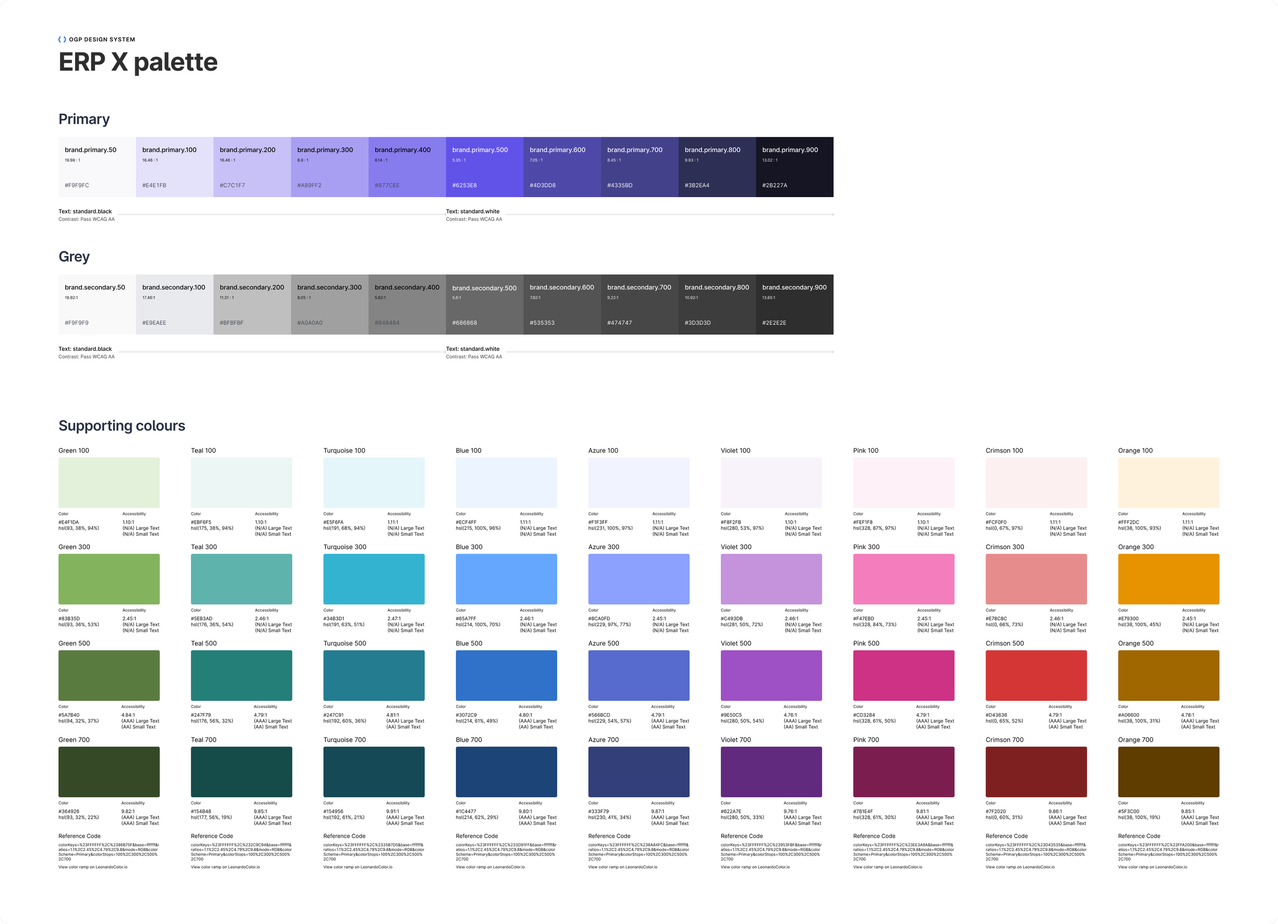
Final UI and colour palette