The most common crimes in Singapore are scams.
In 2020, Singapore saw a record high of 15,756 scams reported, with more than S$201 million (US$151.3 million) lost.
At the time, it wasn’t unusual to receive one scam call every other day, and about four to five scam messages a week. To prevent scam calls and messages from reaching phone users, my colleagues had conceived the original app in a Hackathon project.
They had asked me to review the UI before its public launch. What was originally meant to be a visual check, turned into a quick redesign.
The team
I led the redesign and did the execution myself, working alongside one project manager, two engineers, and a data scientist.

Before
AfterMore than 722,000 scam SMSes reported, and 5,000 phone numbers blocked on Scamshield in six months since its launch. (From Dec 2020 to May 2021)
Product goals
Launch an iOS app that automatically prevents scam SMSes and calls from reaching users.
Don’t be intrusive, and make it function with minimal user intervention.
Provide information about the latest scams.
Be simple and easily built, since the team was small and the public launch date had been fixed.
Design goals
Assure users that we aren’t spying on them or intruding into their privacy (A government app that filters through your calls and messages? Yikes).
Look reliable and professional, especially since the app could be perceived to be intrusive.
Help users set it up easily and activate the right permissions in their settings.
Guide users into content and make it easy to read.
Challenges
Limited resources and time. I was working on other projects at the same time, so I couldn’t do as much exploration or research as I would have liked.
User research
I conducted 5 informal user interviews with a mixture of young and old locals. I wanted to understand their perceptions, validate if the app would be well received, and identify areas where design could help.
Key takeaways
Users were annoyed with the number of scam calls and messages they were receiving, and were enthusiastic about an app that could auto filter spam SMSes and calls.
At the same time, they were also hesitant about using it due to strong concerns around privacy (Would it allow the government to monitor all their communications?)
When I explained how the app would work through an AI model and we weren’t tracking their personal activity, their worries were eased. We just had to make it clear in the app.
It would have been even better if we could have implemented something for Whatsapp or Telegram, as those were also common channels for scammers. Unfortunately, that was not possible.
Design system
I set up a library of styles and components for easy handoff to future designers. This also helped me create UI mockups quickly, and ensure consistency across the app by reusing the same building blocks.
The app was to be managed by the Singapore Police Force, and blue is their official colour. I had considered using their original stately blue, but wanted to soften and detract away from their identity to avoid any sense of being monitored.

An example from their website’s homepage, not exactly what you’d want to see in an app that filters your messages 😂.

The interface
Onboarding

Key things I wanted to focus on when onboarding users:
Explaining how the app worked. That we weren’t compromising on their privacy or tracking their personal activity.
Providing access to more information if they had privacy or security concerns.
Conveying a sense of ease and security.
Helping users understand how to set up the app.

Home pageThe original app didn’t have a home screen. Users were brought directly into the reporting function after onboarding. Instead, I wanted to provide a landing point to guide them into the different content and functions we had.

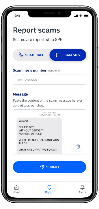
Reporting ScamsWe needed to get users to report scam messages that the algorithm had missed, so that we could keep improving our machine learning model. The original design of the reporting function consisted of a number search in our database before arriving at the two input fields for reporting.

Maintaining a public registry of phone numbers, and showing how many reports had been made on each number might have been good in the sense that it publicly warned users against scam numbers.
However, we couldn’t guarantee wrong reports wouldn’t be submitted, and it would be terrible to have a non-scammer’s number shown by mistake.
I removed the number search, and simplified the reporting function to a single page to reduce interaction and cognition load for users.

In a later iteration, we added the ability to upload screenshots so users wouldn’t have to copy and paste text after seeing users request it in App Store reviews. (What you see in the mockups are real scam messages from my own inbox 😂.)

Users could still type or paste in text if they clicked the text box, instead of the image button.

Submitting the report gets you a little thank you note.
Setting up permissionsUsers who hadn't enabled their app permissions would see a warning status on the setup guide section reminding them to do it.
